Optimizing Your Online Registration Design for Better User Engagement

My team and I have experienced decades of different website design projects that offered different services, many of which included a sign-up process. And throughout the evolution of web applications, I have noticed a variety of approaches to online registration design. Helping business leaders design and optimize that process can be an essential part of the website’s ultimate success.
There are some general facts about online registration UX design.
- There are several different methods available.
- It is not one-size-fits-all. Audiences, devices, and goals differ from site to site.
- It is OK to evolve and change your registration process.
- Customer feedback and real user data aids your website improvements.

Consider these different approaches to online registration design.
Single-Page Registration Forms
A single-page registration form refers to a form that lives on only one web page, The user can fill out all of the fields and submit without the need to click to another page.
This method is a growing trend in e-commerce checkouts. Many shopping carts offer the option to enable a single-page checkout experience where the user can place an order and sign up as a registered customer at the same time. Some major retailers find this to be an ideal experience, however it may work better on desktop monitors, given the lengthy amount of information required to place a complete order.
This approach may not be ideal for everyone. Some business-to-business websites that sell services (like virtual consulting, for example) may require a lot more personal information or preference details to customize their services. In that case, a single form might become rather cumbersome.
If you do strive for a single-page form, it is important to prioritize the order of the fields, and label them clearly. Think about this through the eyes of your customer and what will be clearest to them.
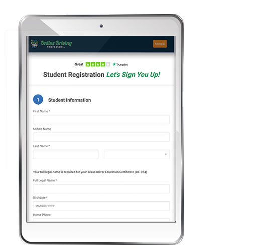
Wizard-style multi-step registration forms
This is one of my favorite approaches to online registration user experience design. You can design an experience that is creative and almost gamified. You can market your process “as easy as 1-2-3” and separate the work into smaller digestible amounts.
One of the benefits of multi-step registration is that you can ask for the minimal required fields in the first step, to very quickly engage the user and capture their record in the database.
If you have three steps in your process, they are already 33% done and engaged. The next step might include a more important piece of commitment like a payment. If the user abandons this step, you have enough information (like their email address or SMS number) to follow up with them.
Because each separate page will likely have a shorter form with less fields to complete, this approach might be a better fit for mobile device users. When you work on designing the online registration experience, be sure to lean into how it will display and interact on a mobile device, especially smart phones with a small viewport.
When the last step is submitted and the user has officially become a full customer, you can flow them right into the onboarding process. I found this works great for online education, as you can get them immediately engaged in their online course.
Trial Registration to Onboard Users Quickly
Popular with SaaS companies, trial registration allows a visitor to sign up for an account without paying a fee. In many cases, the trial account only requires a modest amount of information from the user to finish this first registration. The account might be limited in access to features or just by a defined amount of time. For example, I often see free trial sign-ups offered for 7-days of access to the product.
The advantages of offering a free trial registration include:
- Entice users that are in the early stage of a buyer’s journey to engage sooner.
- Immediately capture their basic info and gain the ability to follow-up.
- Design marketing campaigns to engage these visitors further and upsell them.
- Create excitement about your product before the purchase.
- Help users who need to make a case to their leadership before a purchase.
You can either make the sign-up process very low-lift by only asking very basic information about the person without any form of payment details, or, you can require the payment information up-front without charging anything. Sites that require a credit card during a trial typically auto-charge the person after the trial is over. This means the customer is responsible for taking some kind of action to “cancel” the account. They are technically already a customer, having agreed to terms at the time of this sign-up.

Other Integrations that Optimize Your Online Registration
If you want to make signing up even faster, integrations with common platforms is worth considering. You can integrate the username and password creation part of the process by adding social media platform options like Facebook and Google. You can speed up the payment part of the process by adding options to select Apple Pay, PayPal, or G Pay. Since these platforms are so widely used, thousands of customer already have accounts with them and may have the information readily saved on their mobile devices. That gives them convenience and reduces friction.
As you are evaluating your website plans, keep in mind the many options available to you that can improve your customer experience and your website conversion rates.
If you are seeking help in designing a stellar sign-up experience, contact me to have a conversation.
Managing Director
Posted in: E-commerce, E-learning, Responsive Web Design, Small Business, Web Application Development, Web Design, Web Design Resource, Web Development, WWW Learning Center
Latest & Greatest
- The Evolution of Driving Schools From Classroom Instruction to Mobile-First E-Learning Apps
- How to Write Website Copy That Helps You Rank on Google
- Different Ways to Insert a Contact Form on Your Website
- From Contact Forms to Conversational AI: The Evolution of Website Communication
- How Many Plugins Should a WordPress Site Have?
- How to Prepare Your Website Content
- How to Fix Common Website Bugs