Mobile Theme Design for WordPress
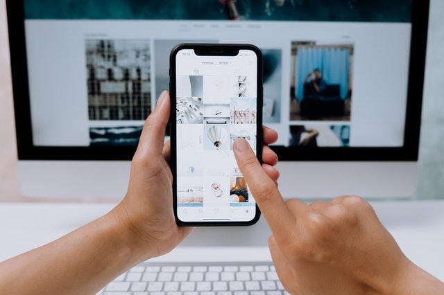
“Mobile-friendly” is a buzzword lately with businesses. Small businesses want to know how to easily develop an attractive mobile website. If you have a WordPress-based website, updating your web design with mobile-friendliness may be easier than you think.
WordPress software is easily customized using “themes”. Your website has some type of theme designed around the WordPress framework to give it a unique look with your own branding, font styles, and layouts.
You can actually design several different themes that are stored as options in your WordPress installation. Some website owners may switch their theme to a different one after a while to give it an updated look (please note that switching to a different primary theme can be more involved in order to retain certain content and settings, so I am not suggesting you jump the gun on this).
By creating a secondary theme designed with alternative CSS and code that is a better fit for a small mobile device, you can give your mobile users a better web experience. WordPress can be programmed to serve up the mobile theme when it detects that a visitor is using a certain small mobile device.
What kind of features might a mobile design have?
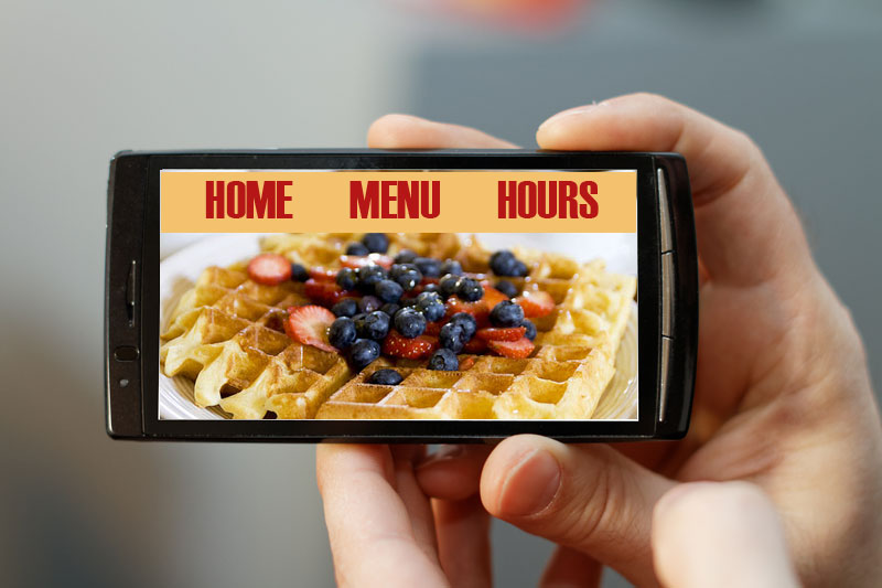
Your website’s “desktop” version will be displayed to other users with larger screens and standard desktop computers, while visitors with small screens on a smartphone will see a design specially fit to be legible and easy to navigate.
Features for better mobile navigation may include an enlarged or simplified menu, buttons that are larger and easier for a finger to select, text in slightly larger fonts, and layouts that are more vertical.
Initiating the switch
There are simple plugins available for WordPress to achieve the “switching” function between the 2 themes. After creating your custom WordPress mobile theme, you can update a few settings to tell the program which theme to display on various mobile devices. (Your mobile design theme can be stored in the same theme folder as your “main” theme, but should have a unique name.)
How does adding a mobile theme help with efficiency?
With this theme switching method, you aren’t required to manage two separate websites with double the content. You can manage one website efficiently and still cater to different audiences.
Posted in: Austin Web Design, Small Business, Web Design, Web Design Resource, Web Site Maintenance, WordPress web design, WWW Learning Center
Latest & Greatest
- Customer Retention: A Comprehensive Guide to Retaining Your Customers
- Top Reasons Why Web Designs Don’t Launch
- Your Website is About Them, Not You: Digital Customer Experience
- Google Business Profile 101: How to Use it & SEO Benefits for Your Local Business
- The Power of Intentional Website Branding
- Competitive SEO Analysis: How to Keep an Eye On the Competition from an SEO Texas Agency
- Optimizing Your Online Registration Design for Better User Engagement
