Picking the Perfect Palette: The Effects of Color in Web Design

Question: What is a good web designer’s ultimate goal? Surprisingly, it’s not to create the sleekest website or the prettiest application interface to ever exist; actually, it’s not about the design itself at all.
Rather, the primary objective of a web developer or designer is to ensure that every single website they touch conveys the right message to visitors, in the way that the site’s owner intended it.
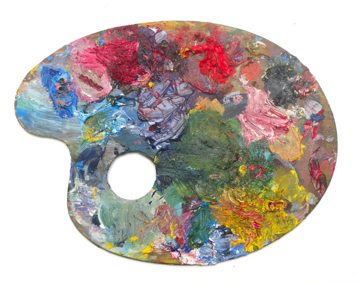
Believe it or not, a lot of this communication is done via visual cues, like color schemes, which is where the “design” part comes in. Speaking of color schemes – selecting the right colors for your website is a particularly important step in creating your digital masterpiece.

Photo by Anni Roenkae from Pexels
Although your website’s color scheme may seem trivial to the average consumer, you are a business. You must always be one step ahead of your customers in terms of meeting their demands – both conscious and subconscious ones. Colors make people feel things, and these emotions trigger actions: scrolling, clicking, subscribing, buying. In fact, according to Harvard Business School professor Gerald Zaltman, 95 percent of our purchasing decisions are made sans logic in our subconscious, emotional brain.
“With the right combination of colors, you have the power to make your visitors feel something about your brand – to connect with it.” (Harvard Business School)
With the right combination of colors, you have the power to make your visitors feel something about your brand – to connect with it. You want your website to resonate with users (in a good way, of course). Evoking positive emotions from consumers can encourage repeat customers and even facilitate brand loyalty.
Are you fascinated by the fact that you can tap into your buyers’ subconscious minds through the colors on your website? If so, keep reading as we further explore the purposes of color in web design and how color psychology can help guide you in picking the best hues for your site.
The Purposes of Color in Web Design
The following are three key reasons that businesses use certain colors in their website’s design.
1. Spark Brand Recognition
According to a study conducted by the University of Loyola, color can increase brand awareness by up to 80 percent. From a design perspective, the idea is that – in a perfect world – anyone that lands on your website will instantly be able to recognize your company and what you do just based upon the colors you choose for your site. (That said, it’s important to note that marketing doesn’t happen in a vacuum; there are lots of other factors that play into how people perceive your brand.) If your enterprise already has established brand colors, it is the web designer’s responsibility to incorporate your existing colors into the design and look for other colors that nicely complement them. For businesses that are still working on their brand’s color scheme, web designers might be able to provide some guidance regarding the feelings that are associated with each hue (more on that later).
2. Emphasize Specific Elements
When drawing attention to a button or specific section of your site, you probably aren’t going to do it using flashing neon lights or large arrows. Instead, you use color. By using the right colors in the right places, you can highlight important elements on your website, such as important texts, call-to-action (CTA) buttons, and even subsections.
3. Influence User Perception
The colors you choose can heavily impact users’ initial impression of your brand and can even affect their overall experience on your website. In fact, color psychology plays a huge role in determining the level of trust that your visitors hold in your business.

Photo by Alena Koval from Pexels
Color Psychology
Research conducted by the Institute for Color Research revealed that people tend to make a subconscious decision about someone or something (read: your brand’s website) within 90 seconds of their initial viewing of the subject. Moreover, between 62 and 90 percent of that assessment is based on color alone. Therefore, knowing what different color families communicate to your website’s visitors is key in giving them the right first impression about your business. Listed below are a few examples of basic colors and how each one can impact users’ perceptions of your company.
Yellow
Most shades of yellow are associated with happiness, creativity, and playfulness, evoking emotions of optimism and excitement. Companies that want to bring out cheerful feelings in consumers (think children’s party organizers, travel agencies, etc.) use yellow to do so. This color also works great in characterizing brands as unique, out-of-the-box types.
Blue
Websites that utilize a lot of blue hues are meant to instill a sense of calmness, trust, and productivity in your visitors. Blue is meant to be an inviting color, encouraging consumers to serenely mosey around your site and decide at their own pace if they trust your organization and believe your claims. Light blue works particularly well for tech and creative businesses, whereas dark blue is more indicative of trust and intelligence, which is great for financial institutions, government organizations, and educational resources like investment learning centers. One such example is SoFi’s Investing 101 Center, which helps users gain valuable financial knowledge in a user-friendly manner.
Green
Because green is found at the center of the color spectrum, it’s often equated with balance and equilibrium; it is also synonymous with nature. Green is a fantastic color for organizations in the health and wellness sector or for companies that offer eco-friendly/organic products.
Clearly, color is king when it comes to effective web design. Even famed American artist Georgia O’Keeffe, acknowledges that color is absorbed by the brain differently than other forms of communication when she said, “I found I could say things with color and shapes that I couldn’t say any other way – things I had no words for.” When building your business’ site, it is critical that your Austin web design company is able to represent and communicate every last sentiment you wish to convey through visual elements – and it all starts with picking the perfect color palette.
Posted in: Austin Web Design, Web Design, WWW Learning Center
3 responses to “Picking the Perfect Palette: The Effects of Color in Web Design”
Latest & Greatest
- How to Write Website Copy That Helps You Rank on Google
- Different Ways to Insert a Contact Form on Your Website
- From Contact Forms to Conversational AI: The Evolution of Website Communication
- How Many Plugins Should a WordPress Site Have?
- How to Prepare Your Website Content
- How to Fix Common Website Bugs
- Security Enhancements for Website Checkout

Interesting read. As a photographer I definitely understand the power of visuals, color specifically. I wonder if there is any research on combinations of colors that actually detract from a brand’s message?
Good point Matt! I suspect that there is data about that. As web designers what we have also seen is the danger in the wrong kind of contrast. Even when colors are beautiful, if the text over the background is not legible or accessible it really puts a dent in the user experience. I suspect there are also colors that reflect certain messages that just don’t go well with the brand’s audience.
Great information! I’m guilty of not paying enough attention to this. My “D” personality tends to focus on big picture instead of these types of details, which are so incredibly important. Thanks for the reminder!!