Wall of Text vs. Doorway Pages: How Do You Create an Engaging Homepage?

There are many trends in web design that lean toward more visuals and less text content. Website designers are asked to create that super engaging “wow” factor for a homepage that appeals to a savvy, young online audience. We are specifically told to avoid the “wall of text” because the last thing visitors want is to do is read, right?
But what about search engine optimization and creating a web page that search engines can read? Are we at risk for a flashback to ’90s doorway pages?
You may recall an old trend in the late-’90s when dark backgrounds, neon graphics, and Flash animation were the latest of cool. This spawned a series of “doorway” style home pages that displayed nothing but a Welcome heading, a dancing graphic, and a link. Visitors had to click the link to continue to the real content. Today, we frown on this strategy because all it does is create one extra click for the user, and the page does not describe what the company does or provide any immediate incentive to continue. It also doesn’t offer enough content that is legible to search engines, so the SEO value of the website is heavily demoted.
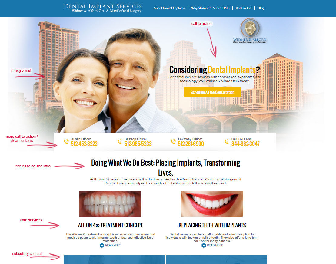
So what is the right approach? The answer is balance. There should be a balance between visuals, interactive content, and text. The actual layout and order of these elements will depend on your target audience. If your audience is only young adults who want to engage in video content and have very little interest in reading text material, then the videos and interactive links should be prioritized. You can break up space in the page with headings and intro text, and you can include more descriptive paragraphs that lead into other sections below your “fold”. Some organizations prefer to have short and sweet homepage designs with no scrolling, but I challenge this assumption. There are plenty of highly recognized websites and premium brands that have very long web pages with several subsections; it is up to the visitor to continue scrolling and engaging with that content if they wish. They often do, if they are the ideal audience for that content. But prioritizing the order is important. Ideally, you want your primary call to action at the top along with your boldest visual element.
I don’t believe there is a set formula for how much text should go on the page.
Here are some possible ways you can approach your homepage content:
- Start with a large image and a bold call-to-action heading and link and follow with 3 of your top product descriptions. The products will be relevant to the audience, so reading a little about them will be appropriate.
- Include a blog feed with a link and teaser of the latest 1 or 2 posts. This gets some frequent updates displayed without showing the entire lengthy text.
- Include the most visual interactive elements at the top, like a slider, a video, or a game – and fill the bottom with a paragraph introduction about your services and what problems (or needs) you solve.
- Plan out 5 subsections on the page, each with a clear heading, a link to a longer section, an image, and 2 intro sentences.
These are just ideas that might flow well on a homepage while still satisfying what the visitor came for. What have you come up with?
Posted in: Austin Web Design, Web Design, Web Design Resource, Web Development, WWW Learning Center
Comments are closed.
Latest & Greatest
- Why Defining Your Organization’s Strategy is Key to Brand and Marketing Development
- Empathetic Storytelling in an AI World
- Customer Retention: A Comprehensive Guide to Retaining Your Customers
- Top Reasons Why Web Designs Don’t Launch
- Your Website is About Them, Not You: Digital Customer Experience
- Google Business Profile 101: How to Use it & SEO Benefits for Your Local Business
- The Power of Intentional Website Branding
