8 Features that Your Non-Profit Web Design Needs to Tell Your Story
How many people are interacting with your non-profit organization’s website? Is it performing as well as it could be? Having a good online presence is extremely important in the modern age. A big part of this is the first impression that a visitor has of you. It determines whether or not they are going to dig deeper into your site or pass you by. For that reason, you want to make sure that you stand out—in a positive way. Investing in non-profit web design will mean a better experience for staff, volunteers, donors, and the general public alike. Here are some of the ways that you can create a more engaging, attractive site.
Keep Your Mission Front and Center
When someone comes across your non-profit organization, they are going to ask themselves, “Why should I support their work?” You need to be able to supply them with a solid reason right on your homepage. How you explain what your values are will make a big difference in how they perceive you. So, ensure that you have a member of your team who has high-quality writing skills to take over this task. It can be a challenge to write for your audience when you have so many types of people checking out your site. But by simplifying the language and leaning away from industry jargon, you can successfully reach everyone.
Your homepage isn’t the only place where you should identify what your cause is. Make a web page that specifically outlines your mission. Mission statements offer a way to unify the stakeholders of your organization. That being said, across every aspect of your non-profit web design, it should be clear what your aims are.
Don’t Hide Your Call-to-Action Buttons
Always provide the next step for engagement. You need to use phrases on your website that encourage visitors to take a specific action. Known as calls-to-action (CTAs), these should simultaneously be simple and inspiring. Display them prominently across your organization’s site so that new supporters feel encouraged to dig deeper into your content. The most important ones should be visible without having to scroll down the page.
A strong CTA can really make a difference in terms of increasing involvement from your site visitors. This ranges from sparking the desire to donate, to urging people to provide their time, to just getting them to check out your latest announcements. These are ten examples that you can add to buttons in your non-profit web design, depending on what it is that you do.
- Adopt Me!
- Support a Child
- Sign Up for Our Newsletter
- Volunteer Today
- Make a Donation
- Learn More
- Join Our Movement
- Watch Now
- Become a Member
- See the Impact
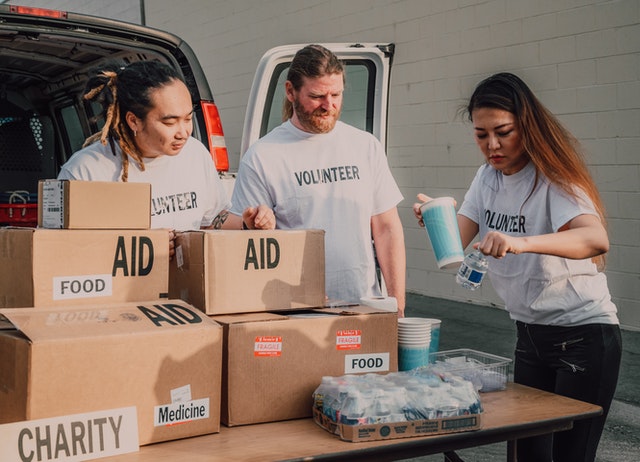
Set Up a Press Release Page
Keep your donors up to date with your latest activities. This way, they know that their money is going to use in the best ways. Incorporating a press page into your non-profit web design will continue to spread the word about all of the good work you are doing. By handling this page yourself, you provide accurate and timely information. Media outlets that are interested in your organization are able to quickly identify stories to share with the public. Educating the public results in an increase in interest from both volunteers and prospective donors.
If you don’t have a PR professional on your team, there is no need to worry! Writing a press release is simple. You first need a short headline that will entice someone to click on the piece. Then, you need to get to the point in your copy. Fulfill the who, what, when, where, and why of the story, while highlighting your credibility. If you have any quotes from members of your team, these can be supportive of your essential details.
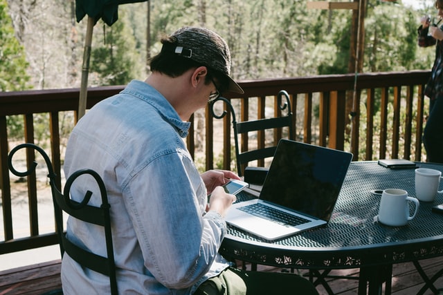
Photo by Julian Lozano on Unsplash
Optimize Your Site for Mobile Usage
Today, just about everyone has a smartphone. Odds are that they are using the search engine browser on their phone to look for answers to questions while they are on the go. Some of these questions may be about causes they want to get involved in. With that in mind, it’s imperative that your non-profit web design is responsive across devices. If it isn’t, you could be missing out on lots of supporters who are arriving on your website through mobile. To combat this possibility, a professional web designer should test your site on all device types and browsers to make sure that it looks correct.
You want every feature to be accessible. Some ways to optimize your site include using larger buttons that are easy for thumbs to click, avoiding putting an excessive amount of elements on a single page, and keeping the layouts vertical. Think about what kind of experience you would like to have when you are visiting a site from your smartphone.
Create a Blog to Explore More Topics
Blogging lets your organization consistently put out keyword-rich content. This will bring you higher in the search engines so that more internet users can find you. Giving them relevant, valuable content is the number one way for you to improve your SEO. Set up a blog calendar to keep your non-profit website fresh. Don’t go several months without posting anything. Search engine crawlers are known to prioritize websites that regularly create new content. The more blog posts you produce, the more the crawlers have to share.
Not only is a blog a good idea to integrate into your non-profit web design, but it also serves as a tool for your other digital marketing strategies. For example, you can use the information from your blog posts on your social media channels. Let your followers on Facebook or Instagram know that you have something new for them to check out. Point them to the link in your bio. You can do the same thing by linking to your blog in your newsletters, too.
Did you know that 64% of non-profit content marketers regularly publish blogs? It’s one of the best ways to educate stakeholders!
Use Impactful, High-Quality Multimedia
Education and Employers is a charity based in the UK. Its mission is to provide children across the country with the opportunity to meet a diverse range of workers. In doing so, they hope to eradicate the stereotypical views that those children are ingrained with by society. A short video was published on YouTube in 2016, entitled #RedrawTheBalance. Students can be seen largely drawing men in certain positions. They are then surprised to find that the volunteers who come in to represent those jobs are women. It ends with an image of one of the few students who drew a female firefighter.
This is the kind of content that will stick to someone’s mind. You want your videos to serve as a powerful reminder of what you and your supporters can accomplish together. Considering multimedia content is such a great way to reach a large audience, it’s an important investment that you can implement into your non-profit web design.
Make Sure the Navigation is Clear
Your visitors should be able to tell exactly where they are going when they look at your navigation menu. This is the bar across the top that lists your internal web pages. It would include the priorly mentioned mission and press pages, on top of any other necessary landing pages. If you have a content-rich site with subpages, they can be nested in the sub-navigation menu, otherwise known as the drop-down menu. Having too many titles across the bar would make your non-profit web design immediately appear cluttered.
A good rule of thumb is that a visitor should be able to find what they need in just three clicks. Streamlining their experience will make them more likely to return and or take the requested action. When you are deciding how to label your navigation menu, make sure that you are being obvious. All titles should be between one to three words. Overly generic wording could confuse the user, resulting in them not clicking where they should.

Photo by Julia M Cameron on Pexels
Simplify and Secure Your Forms
Forms are something that you cannot skip in your non-profit web design. Much like any other site, you should have contact forms. Visitors can reach out to you from there by providing their name, email address, phone number, and an explanation of what they would like to know. The other type of form you need is for donations. Your donation page should be easy to find and use. Donors are taking the time out of their day to give you money for your cause, so don’t take advantage of that by having an extremely long form. Get down their information and payment, and get out of there.
Online donation forms are a great way to raise money for your organization. However, because you will be handling credit card information, you need to ensure that your visitors are safe from having their personal data stolen. Make donors feel secure. Incorporate security logos on your forms to assure them that you fit industry standards by being PCI-compliant.
With your new and improved website, you can start building greater public trust as you are viewed as a more legitimate organization. So, if your site isn’t spreading its reach beyond local supporters, it may be time to touch base with the professional non-profit web designers at WEBii. Our team can make your site a space that really shows off who you are, to inspire others to join your cause.
Posted in: Content Marketing, Mobile Web Design, Non-Profit Web Design, SEO, Web Design, WWW Learning Center
Latest & Greatest
- The Evolution of Driving Schools From Classroom Instruction to Mobile-First E-Learning Apps
- How to Write Website Copy That Helps You Rank on Google
- Different Ways to Insert a Contact Form on Your Website
- From Contact Forms to Conversational AI: The Evolution of Website Communication
- How Many Plugins Should a WordPress Site Have?
- How to Prepare Your Website Content
- How to Fix Common Website Bugs