Best Practices When Designing Buttons for Good UX
Although user interface (UI) and user experience (UX) are oftentimes used interchangeably, they are different things. UI is actually a subset of UX. With UI, the focus is on the looks and functions of a design element. Alternatively, with UX, web designers are concerned with the full integration process to create conditions that ensure that users have a positive impression of an element. This is an ongoing process because consumer feedback is going to inevitably change over time.
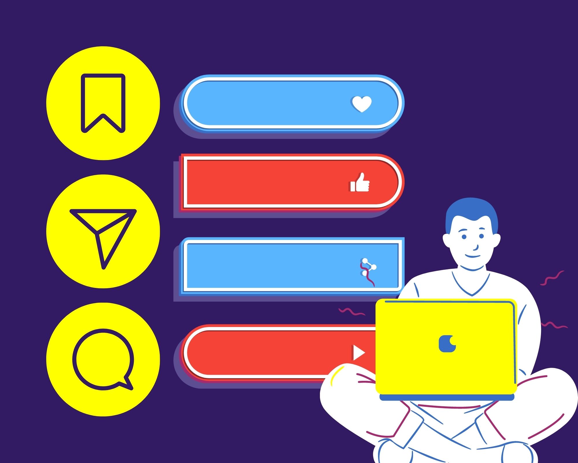
UX designers focus on usability, accessibility, and desirability. A big part of this is buttons, which can be found on pretty much any website out there. The goal of them is to make a user take an action, with that action being a single tap. Buttons should be located throughout your site so that, no matter which web page someone lands on, they will be encouraged to complete that action. Let’s give you some more insight into the necessity of having buttons for good UX.
Where Are Buttons Expected to Be Placed on Your Site?
Users will already have an idea in their head of where buttons should be located. Because of this, you need to stay in accordance with standard UI patterns. This will enhance the discoverability of your buttons. Here are some places they should go.
- Top: Place a primary call-to-action beneath the heading to pitch a sale, and a secondary one to provide access to more services.
- Middle: This is the perfect space for secondary CTAs, such as “Join Our Newsletter,” to promote other sections of your website or your marketing efforts.
- Bottom: Continue to recommend users to get started with your offers through the use of a primary button for UX.
- Footer: Add buttons for the social media platforms that you use, including their extremely memorable logos instead of words.
How Do You Know What to Write to Make Them Effective?
Think simple! You don’t need entire walls of text to explain to someone why they should be able to interact with your buttons for good UX. Instead, they should know at a single glance where they are headed next if they do click them. For this reason, use actionable, task-specific words to avoid confusion. These may include “Browse Services,” “Add to Cart,” or “Submit.” Doing this means that you are using calls-to-action, which are written directives that prompt an immediate response from the user.
Your Buttons Must Be Accessible for All Audiences, But Are They?
Make sure that you are using the right contrast ratio on your buttons. This is how much the text stands out against the background, and is important because it determines legibility. You also need to display the right sizes for desktop and mobile. Users with visual impairments should be able to increase the font size in their browser without having elements cut off. The World Wide Web Consortium (W3C), whose mission is to make the internet an accessible place for everyone, says that there are particular criteria that websites must follow. It comes down to the four standards of being operable, perceivable, robust, and understandable.
What Interactive Design Should They Have to Up Your UX Game?
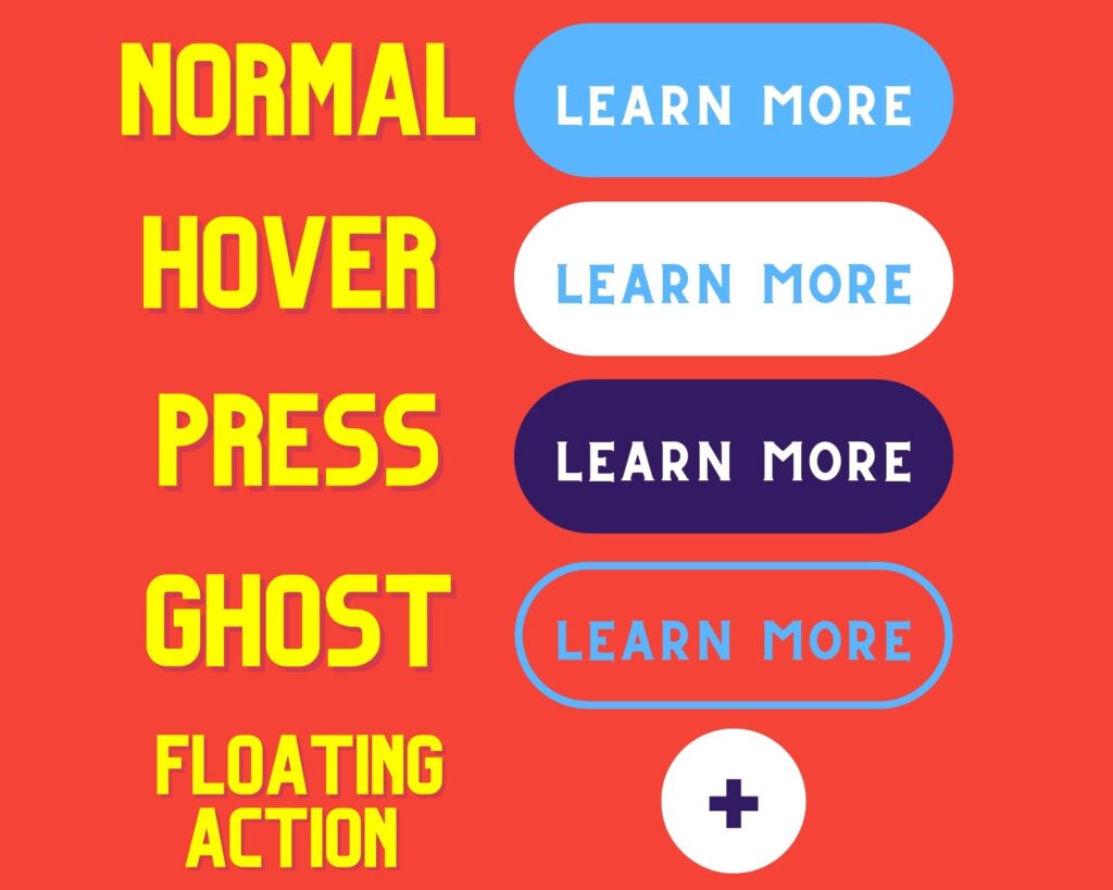
First of all, users need to recognize that your button is, in fact, a button. And you shouldn’t have elements on your web pages that look like buttons that aren’t. Upon interacting with them, users want to receive instant visual feedback. This is why there are design options like the hover effect. When a cursor is over the top of a button, the color changes. It is one of the most used CSS effects in web design, and benefits you because it increases the chance of receiving clicks. At the end of the day, it isn’t just a matter of whether the button links users to where you want to link them.
How Can You Differentiate Primary and Secondary Buttons for Good UX?
Primary buttons require the most attention from your users. After all, they accomplish the most important goal on the page. So, you only need one. For example, when you go on a social media platform, such as Twitter, you are currently given four prompts. The first two are to sign up with Google or Apple, the third is to sign up by phone or email, and the last is to sign in if you already have an account. The only button that is blue is the third one, while the others are white. This difference in color visually indicates that it is the primary button for good UX, meaning Twitter wants people to make an account this way.
Our team at WEBii wants to help you have a responsive web design that is both beautiful and functional for all devices. In part, this means creating attention-grabbing buttons that drive your users in the direction you want. Come chat with us to start customizing a solution that fits your business’s needs.
Posted in: Mobile Web Design, Responsive Web Design, Web Design, Website Usability, WWW Learning Center
Latest & Greatest
- The Evolution of Driving Schools From Classroom Instruction to Mobile-First E-Learning Apps
- How to Write Website Copy That Helps You Rank on Google
- Different Ways to Insert a Contact Form on Your Website
- From Contact Forms to Conversational AI: The Evolution of Website Communication
- How Many Plugins Should a WordPress Site Have?
- How to Prepare Your Website Content
- How to Fix Common Website Bugs