Beyond the Boring Slider: Alternative Homepage Designs
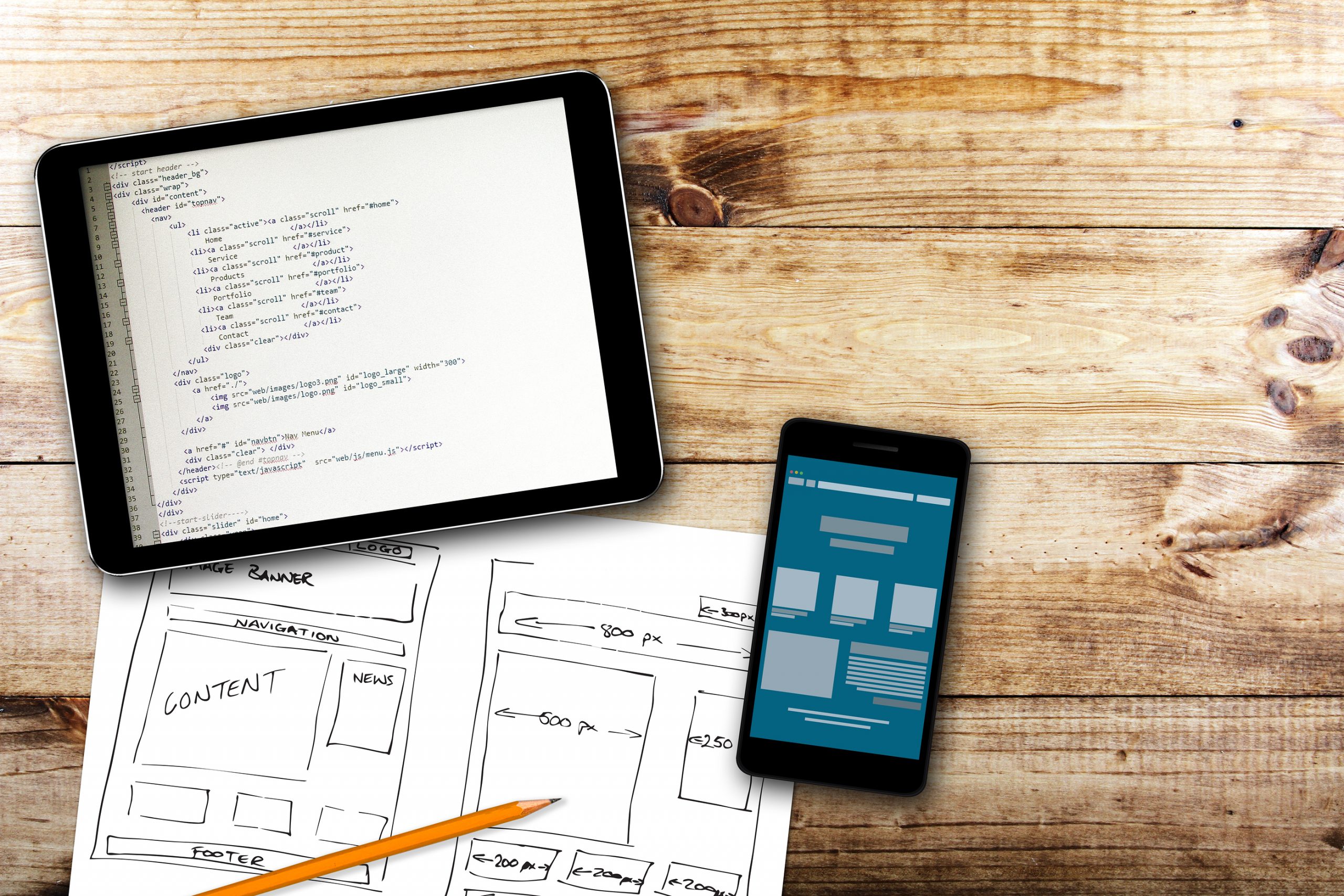
One of the most common website features people gravitate toward is the image slider. A slider is usually a series of images (photos or illustrations) that rotate with a transition effect, like a fade-in, fade-out, or a “slide” (hence the name) from right to left. The image slider has been around for a while. It can be coded with some PHP, javascript, or HTML5 into a web page, or it can be added with plugins or modules. (Popular plugins for WordPress are Royal Slider, Revolution Slider, and Meta Slider.) But sliders also pose a few problems. Below are four examples of sites that go beyond the average image slider.
Sliders pose a few problems.
Sliders are often poorly optimized and cause slower loading times for the website.
Many of the slider plugins are known for slow performance. Since they are usually added to the homepage of a website, this means that the main entry page of your website may be several seconds slower to load on someone’s desktop or mobile device. A slow website causes issues with usability, visitor conversion, and SEO.
Image sliders with elaborate animations or wild transition effects can also be distracting.
If visitors are distracted by the slider, they are less likely to notice your call-to-action content or they might become annoyed with your website altogether.
Sliding and animated images are not very mobile-friendly.
Remember when I mentioned that sliders can be slow? Slow loading is like death on a smartphone browser. Mobile users just don’t have the patience to wait for anything fancy to animate. They are on the go and want information fast. Mobile responsive websites can be attractive, but they also need to be to the point.
And lastly, the average slider can be boring.
If the largest element at the top of your homepage is nothing but a series of low-quality images, visitors will not feel compelled to continue reading the page, let alone buy anything.
There are other ways you can create a compelling homepage.
Creating an enormous sliding image banner is not the only way to design a homepage. In fact, there are plenty of other neat things that modern web developers are doing that completely avoid the slider.
Add a form to a masthead image.
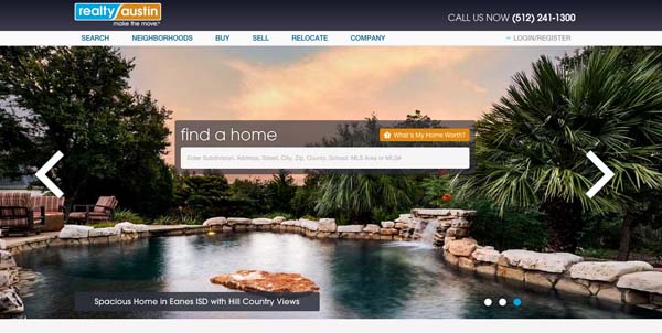
example from realtyaustin.com
This example still includes a slideshow of images, but they do not automatically animate and the main focus is much more customer-centric: a form. In this case, the form is a searching tool that gets the customer immediately to the information they are looking for, which is searching for a home. This is becoming a popular format for real estate companies, and for good reason. The images are still beautiful and colorful, but they have become a background instead of just taking up space with no purpose. The search form is an action that the visitor can take to immediately start engaging with the website. No more waiting around for an image to rotate.
Lead with your call to action statement.
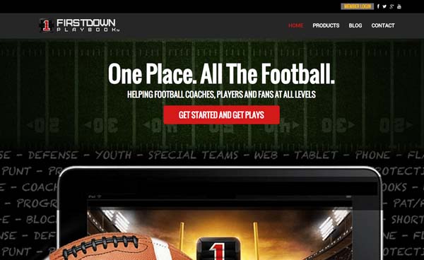
example from blog.firstdownplaybook.com
Let’s just get right to the point, shall we? This website doesn’t want to show off pretty images, because it has a bigger purpose. This website is creating a community of followers and members, so it leads with a membership engagement statement and continues with blog content below. Furthermore, the text at the top of the site may seem simple, but it includes the main keywords valuable to this site for SEO, and it clearly conveys to the audience that the site is relevant to them.
Add background video of your business in action.
example video background from phonedoctors.com
This is a newer and interesting trend I have seen on a few sites. At one point, PayPal had some background video like this on their homepage, as well as Spotify. It is more frequently seen in entertainment media websites, like for websites that are promoting a major film and showing clips of the movie as a backdrop. Video is a growing industry that has many benefits, including creating an emotional and highly immersive visitor experience. However, it also poses challenges like page loading time and file size. It is important to consult with the videographer to optimize any video that you intend to embed directly to a background banner like this. When possible, the video might be hosted on a CDN (content delivery network) or video hosting service for better performance.
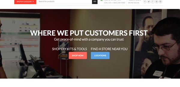
Promote better by pushing sign up and products to the top.
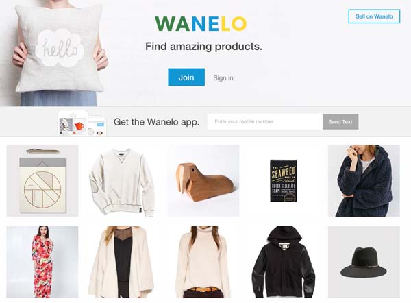
example from wanelo.com
If you are running an e-commerce site, your priority is more sales. So why not ditch the big ad-like images at the top of the page and allow the catalog of products to move up to the shoppers eye level? This example has a simple approach, but I am personally a fan of even more product emphasis with a smaller header. Ensuring that your first series products are visible when someone opens the site on smaller computers like 15″ laptops and tablets means that people can be immediately intrigued to shop.
SEE ALSO: 4 Elements Every Business Should Include on Its Website
Managing Director
Posted in: SEO, Web Design, Web Design Resource, Web Site Maintenance, WWW Learning Center
One response to “Beyond the Boring Slider: Alternative Homepage Designs”
Latest & Greatest
- The Evolution of Driving Schools From Classroom Instruction to Mobile-First E-Learning Apps
- How to Write Website Copy That Helps You Rank on Google
- Different Ways to Insert a Contact Form on Your Website
- From Contact Forms to Conversational AI: The Evolution of Website Communication
- How Many Plugins Should a WordPress Site Have?
- How to Prepare Your Website Content
- How to Fix Common Website Bugs
It’s important to remember that egos are on the line on both sides of the client – web professional divide.