Dress Up Your Custom Web Design: The Use of Color in Communicating Your Message
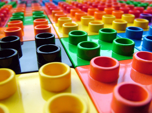
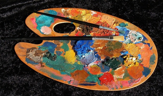
Because color is so ubiquitous, its importance is often overlooked when it comes to web design. However, color is actually one of the most effective elements of custom web design. In fact, up to 90 percent of a customer’s initial decision-making process about a product is determined by color. The way in which you use color in your custom web design can make or break the success of your web page. While there are as many ways to use color in web design as there are web pages, there are a few tips, tricks, and psychological facts that can help guide you toward more visually appealing web pages. What follows is a look at some of the ways in which color can influence the message your website sends.
Color should be used to draw attention to the most important elements of web design.
Because website visitors spend only a few seconds evaluating your web page before deciding whether to stay or not, your custom web design must direct their attention to the most important elements of the page. And, one effective tool for doing so is the way in which colors are used. Perhaps you want people to notice your “Buy Now” button on a product page. Or maybe you want them to examine the navigation bar in order to entice them further into your site. Or perhaps there is another element that they need to pay attention to. In order to catch your visitor’s eye before they move on to another website, you should highlight those elements using color.
Colors should complement each other within your custom web design.
Bright colors that stand out on the web page are a good way to get people to pay attention to the important elements on that page. Contrasting colors also work well for the text of your site. But even when you are creating contrasts within your web design, you need to ensure that the colors complement each other. For example, text should stand out from the background of the web page in order to make it easier to read. But, certain combinations of colors, such as those with the same tonal values (e.g. black and white or red and blue) can make it difficult to read the text. Likewise, colors that do not complement each other in some way can clash, leaving a sense of discomfort, chaos, or negativity that might drive visitors away.
Colors should set the tone for your custom web design.
Chances are you want a custom web design because your company is unique. Its personality, values, and goals are unlike any other business out there (and if they aren’t, you should probably work on your branding). You want your web design to reflect this individuality. And, it can, especially if you use colors the right way. Colors play a large role in setting the mood of your entire web design project. For example, yellow often communicates warning. Orange can be a fun color, but also communicate cheapness.
Green can convey a sense of elegance and is also classically used to reflect eco-friendliness. Bright primary colors are often used for websites and items related to children. In order to set the right tone for your website, you must be able to identify your company’s personality and capture that in the right combination of colors and shades. You may want to stick to classic colors or branch out into more creative uses of color, depending upon your goals for your website. Your web developer should be able to help you identify the right colors to use if you can articulate what makes your brand unique.
The colors in your web design should appeal to your target audience.
Not every audience will respond the same way to the same colors. In particular, culture, age, and gender can influence people’s response to color. For example, blue, purple, and green are favored among women, while blue, green, and black are favored among men. Younger visitors prefer strong colors and contrast far more than do older visitors. Culture in particular can have a strong impact on the colors you choose for your web design. For example, white is a relatively neutral color for Americans but is associated with mourning in China. Red, on the other hand, is a color of good luck in China, but can sometimes have negative connotations for Americans. Some cultures are offended by the color pink. When creating your custom web design, then, consider the age, gender, and especially culture of your target audience in order to select colors that will communicate the right messages to them.
Make sure that color appears in your custom web design along with white space.
Finally, color tends to work best if it appears along with white space in your web design. White space makes the colors you choose more impactful because it allows those colors to stand out. In addition, white space provides an area where your visitors’ eyes can rest from the busyness of the color, giving them a chance to think and respond to your messaging. Put white space to work in your web design by using it to separate elements from each other so they stand out, using it to create a less busy feel, or to direct visitors’ attention where you want it to go. Successful use of white space should complement, instead of detract from, your overall use of color.
Color in web design can help to guide, communicate with, entertain, and appeal to visitors. As a result, its thoughtful use in your site can help you to create the right space for your target audience. When creating your web design, consult or hire the services of professional web developers who can guide you toward the colors that will work best for your individual site. By drawing attention to important elements of your web pages with color, using colors that complement each other, using colors to set the right tone for your site, taking your target audience into account when using color, and ensuring that color appears alongside white space, you can enjoy a colorfully effective website.

Content Specialist
Posted in: Austin Web Design, How To, Web Design, Web Design Resource, WWW Learning Center
Latest & Greatest
- The Evolution of Driving Schools From Classroom Instruction to Mobile-First E-Learning Apps
- How to Write Website Copy That Helps You Rank on Google
- Different Ways to Insert a Contact Form on Your Website
- From Contact Forms to Conversational AI: The Evolution of Website Communication
- How Many Plugins Should a WordPress Site Have?
- How to Prepare Your Website Content
- How to Fix Common Website Bugs