7 UI Design Mistakes You Should Avoid
Your website needs to be attractive to your visitors. Otherwise, they are likely to bounce. This means being aware of what user interface (UI) design they would like to see. UI design is the graphical elements that make up a website or application. These elements should promote ease of use in a stylistic way. Your graphic designer will have to consider every visual element, animation, and interaction in order to ensure a positive user experience (UX). Learn how to make your site look gorgeous by working with the best web designers in Texas to keep these seven common UI design mistakes at bay.
Unresponsive Design
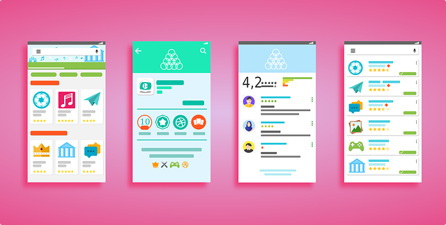
It’s important to test that you have a website design that is responsive across all devices. This means that, no matter what size the screen is, it looks clean and is easy to use. Not everyone is accessing your site through a desktop. Oberlo found that, as of 2021, mobile web traffic makes up 54.8% of global web traffic. This means that there has been a 75.9% increase since 2015, and the number only continues to rise. You can’t risk a UI design that is incompatible with so many users. In fact, it’s more cost-effective and efficient to create a responsive design than a separated one.
Inconsistent Style
Although experimenting with design is fun, minimalist styles are the way to go to combat other UI design mistakes. As they say, less is more. Web designers must create the most usable site possible, and minimalist principles can help them make it more effective with fewer elements. This is the easiest way to keep your website looking consistent and not overloaded. Everything should be formatted in a uniform way. Use the same fonts and color palette across each web page, in your header and footer, titles, paragraphs, graphics, and charts and graphs. Universal, accessible design benefits your UX because it improves the learnability of your site.
Low-Quality Images
Nobody likes distorted photos. This UI design mistake makes it seem like you don’t care enough about your website to bother with image resizing. Or else it means that your equipment isn’t professional enough. It could then translate into how people think you run your business at large. Ultimately, it doesn’t matter if you have great copy if the rest of the web page looks rough. Our brains process visuals 60,000 times faster than text, so it is imperative that you connect with users in both ways. For organizations on a budget, beautiful royalty-free images. On the other hand, if you have some extra money to spend, invest in a local photographer.

Photo by Shutterbug75 on Pixabay
No Text Hierarchy
Organization is key to providing a good UX. Your web designer needs to take this into account across every page with regard to character spacing, sizing, and color. There should be enough visual contrast between information blocks. Web designers must be mindful of the H1, H2, and paragraph tags. That is to say, the main point on your web page, such as the title of a blog post, should not be in a paragraph. Instead, it should be the biggest text to showcase its importance. Not only does having properly formatted text help out your users with finding information, but it helps your SEO and, therefore, your ranking.
Exhausting Forms
Connect with your audience without frustrating them by asking for too much. Some ideas for forms include your Contact Us page, customer satisfaction surveys, and check-out pages. Understand that your forms don’t need to cover every single base. Get the information you need about your users and get out. You can always gain more insight later on down the line, so, for the time being, break up forms into logical sections to fulfill what you need right now. If your forms are not constructed well, the UI design mistakes they create lead to UX mistakes. Remember to provide visual, actionable feedback as consumers are completing them.
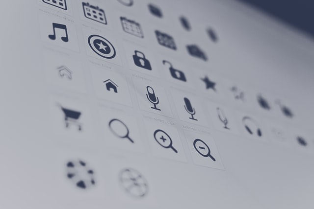
Photo by Harpal Singh on Unsplash
Poor Iconography
Much like with your images, your icons should be high-resolution. To ensure they will appear correctly across device sizes, use Scalable Vector Graphics (SVG). Also, much like with your text, your icons need to be consistent. Make them either filled or outlined. These factors are especially necessary if your site is utilizing icons as buttons, rather than just decorative elements. Which, quite frankly, should be the case. E-commerce shops can use a shopping cart or bag icon instead of writing out that this is where your products are being stored. Social media icons are also commonly used because they are such distinguishable logos. Your iconography needs to be easily recognizable.
Too Many Pop-Ups
Don’t throw intrusive pop-ups all over your website. If you wouldn’t want to have to keep clicking out of them, neither will your customers. And, for that matter, neither will Google. While that isn’t to say not to use them, they should be limited so that it’s easy to navigate between pages. Because UI design is focused on the look and function of an element, your site needs to provide visuals that add value to those interacting with it. The call-to-action pop-ups that you do end up using should be responsive and fall in line with the rest of your design.
Don’t get bogged down by UI design mistakes. Make your website look professional and attractive with the Austin web designers at WEBii. With 26 years of design work under our belt, we have seen it all. Contact us to get started with our services so that you can accurately show off your brand.
Posted in: Mobile Web Design, Responsive Web Design, Web Design, Website Usability, WWW Learning Center
Latest & Greatest
- The Evolution of Driving Schools From Classroom Instruction to Mobile-First E-Learning Apps
- How to Write Website Copy That Helps You Rank on Google
- Different Ways to Insert a Contact Form on Your Website
- From Contact Forms to Conversational AI: The Evolution of Website Communication
- How Many Plugins Should a WordPress Site Have?
- How to Prepare Your Website Content
- How to Fix Common Website Bugs