How to Design a Readable Website with the Rules of Typography
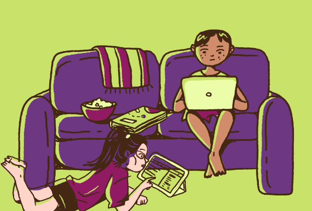
We read digital content all the time. It’s on our phones when we scroll through Twitter, it’s on our computers as we read through blog posts, and it’s on our tablets when we check out an e-book. Our reading also happens on graphics, where the words are surrounded by colorful visuals. While we enjoy consuming all of the above, we may not even stop to think about how much thought has gone into the typography. It’s so much more than just picking out a nice-looking font. We are going to cover some major rules of typography so that you can make the best web content possible.
Infographic: Rules of Typography Terminology
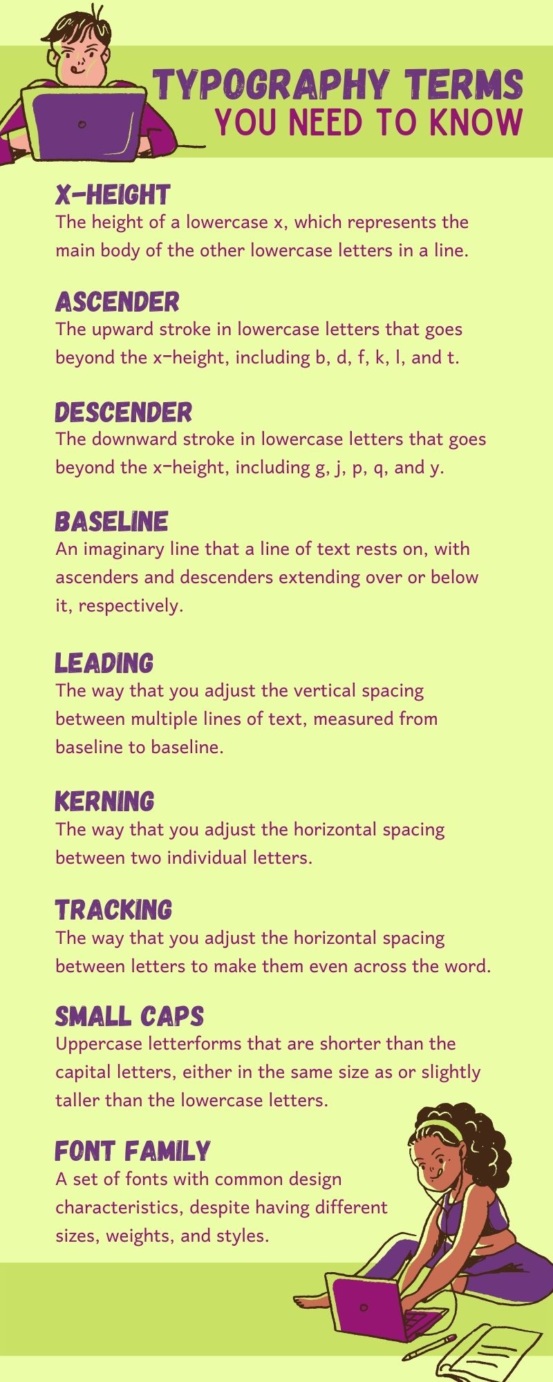
Infographic resources from Canva.com and Megan Marshall
- X-height: The height of a lowercase x, which represents the main body of the other lowercase letters in a line.
- Ascender: The upward stroke in lowercase letters that goes beyond the x-height, including b, d, f, k, l, and t.
- Descender: The downward stroke in lowercase letters that goes beyond the x-height, including g, j, p, q, and y.
- Baseline: An imaginary line that a line of text rests on, with ascenders and descenders over or below it, respectively.
- Leading: The way that you adjust the vertical spacing between multiple lines of text, measuring from baseline to baseline.
- Kerning: The way that you adjust the horizontal spacing between two individual letters.
- Tracking: The way that you adjust the horizontal spacing between letters to make them even across the word.
- Small caps: Uppercase letterforms that are shorter than the capital letters, either in the same size as or slightly taller than the lowercase letters.
- Font family: A set of fonts with common design characteristics, despite having different sizes, weights, and styles.
#1: Don’t Use Too Many Fonts
When it comes to branding, choosing your fonts is a big deal. They can make someone recognize your business immediately. Think about Disney’s signature font, for example. Everyone knows that Waltograph, or Walt Disney Script, belongs to them. So, if you want to be memorable and evoke emotions from your audience through your fonts, you have to figure out which ones best suit your own brand. Keep in mind that mixing typefaces can make your website appear unprofessional. For this reason, a rule of typography is to use no more than three. They should be distinguishable from one another and complementary.
#2: Scale Your Headings Appropriately
Visual hierarchy clarifies to the reader what information they should be focusing on. In this rule of typography, it’s all about decreasing visual prominence on your web pages. Your body text should be the smallest. This way, your reader knows that it’s the detailed content that they are going to want to dive into. The largest-sized heading (known as the H1) on the page can be identified as the most important point. This will be between 180% and 200% of the body text size. From there, your secondary heading (the H2) will be between 130% and 150% of the body text size. Minor section headings will shrink accordingly.
#3: Pick Colors That are Legible
Color is a critical part of web design. There are millions of them out there to choose from! But not all of them pair well together. An important rule of typography is that you need to think about what is going to contrast enough to ensure that your copy is readable. This means being mindful of both your font colors and background colors. Consider using WebAIM’s Contrast Checker tool to ensure that you have an accessible palette. It shows you whether your normal text, large text, and graphic components would pass a contrast ratio test.
Types of Fonts
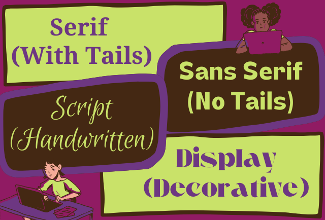
- Serif (With Tails)
- Sans serif (No Tails)
- Script (Handwritten)
- Display (Decorative)
#4: Be Aware of Line Spacing
You may not put too much thought into line spacing, but it can certainly impact the feel of a design. If it’s too small, it will make the text appear crowded. There needs to be enough white space between lines to give them room to breathe. Optimal spacing is between 120% and 145% of the point size. To fulfill this rule of typography, you need to keep this spacing consistent. Apply your base white space value as a single-direction margin to all of your relevant elements. This is known as vertical rhythm, which creates a visually relaxing experience.
#5: Your Text Needs to Be Responsive
Your website isn’t going to look exactly the same on every device. It simply can’t. A smartphone screen is a much different size than a desktop computer. So, your web pages are going to be condensed to fit the area. Whenever you add copy to a page, and before you publish it, you need to test that page across device types. By doing this, you will see if some words go off the page or outside of a box. A professional web developer can execute this rule of typography through responsive modular scaling.
#6: Stray Away from Writing in All Caps
You don’t have to use capital letters to get your point across in a piece of text. The reader may interpret that as you shouting at them, which has the potential to be offputting. Of course, there is a time and a place for it. Maybe your headings are consistently all in caps, for instance. But, according to the rules of typography, the body copy of your web pages isn’t one of those places. Instead, you could emphasize text by bolding or italicizing certain words. Or, if you are committed to using caps, use them for only short strings of words, not for full-length sentences.
When professionals are exploring how to sell web design services, they focus on the functionality of a website. But a reliable web designer will dig deeper to help clients achieve their business goals by making every aspect of a site pleasing to the eye.
#7: Limit the Length of Each Line
Having a huge wall of text doesn’t do anyone favors. It can actually make a sizeable amount of your site’s visitors bounce. After all, the attention span of humans is dwindling. In 2000, it was clocked at an average of 12 seconds. But as of 15 years later, it was down to 8.25 years. For that reason, a rule of typography is finding the sweet spot of the amount of text on a line. Web designers agree that this is about 60 characters. By the time you get up to 90 characters per line, that’s when your readers will start feeling especially overwhelmed.
WEBii has been designing websites for over two decades. With clients spanning from e-commerce gift shops to engineering solutions to cookie-baking companies, there is no doubt that your business will fit right in the mix. Get in touch with the team for great custom web design work. Let us use our knowledge of the rules of typography to make your site even more attractive.
Posted in: Responsive Web Design, Web Design, WWW Learning Center
Latest & Greatest
- The Evolution of Driving Schools From Classroom Instruction to Mobile-First E-Learning Apps
- How to Write Website Copy That Helps You Rank on Google
- Different Ways to Insert a Contact Form on Your Website
- From Contact Forms to Conversational AI: The Evolution of Website Communication
- How Many Plugins Should a WordPress Site Have?
- How to Prepare Your Website Content
- How to Fix Common Website Bugs