Fonts: Handle Them Carefully!
“Handle them carefully, for words have more power than atom bombs.” -Pearl Strachan
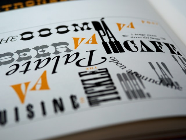
What’s in a font?
In a world flooded with visual communication, our senses are inundated daily by an incalculable volume of typography. For those unfamiliar with the term, typography is the study and application of communication through the media of words, letters, and communicative symbols. Even an untrained person can pinpoint many of these hastily and cheaply assembled blocks of text in various advertisements and identify when one appears unprofessional or poorly crafted. But what, one might ask, is the difference between “good” typographic communication and “bad” typography?
1) Simplicity
One of the basic rules of typography is the rule of simplicity. This rule urges a designer to use a maximum of two or three different fonts (a font is a family system of designs, one for each letter of the alphabet) in a single piece of collateral. Designs with multiple fonts begin to lose their unity, and the communicative power of the whole is lost to the competition between the “sum of its parts.” Professional fonts are full of myriad variations of size, thickness (weight), and angle (italics or obliques). These variations can be used to emphasize specific text, provide headlines and captions, and create text-integrated display graphics — all without breaking the harmony of the design.
2) Hierarchy
Before the advent of mechanical printing, book designers have created standards for informational hierarchy. This hierarchy helps the viewer understand which text is most important, least important, and what information lies directly between the two. Furthermore, in the realm of web design, hierarchy must be properly established to denote navigational elements like buttons and tooltips. There are a variety of methods to establish the hierarchy of font sizes needed to subliminally communicate the importance of various categories of text to the viewer. One common method is the use of the “golden mean,” the ratio of perfect proportion (also known as the Fibonacci sequence). For example, if one has a design using a body copy size of 11 pixels, the Fibonacci sequence states that the next highest level of hierarchical information will occur at 1.6180339887x, or (in this case) 17.8 pixels. The next highest from 17.8 pixels would occur at 28.8 pixels. A level of the information below the main body copy would occur at 6.8 pixels. Using these ratios is a way to establish the levels of importance for various groups of information that resonates with the audience on a subconscious level. It is a structural method that is both mathematically sound, and aesthetically pleasing.
3) Use professional fonts
Font design is a serious segment of typography and graphic design. Many users take fonts for granted, because for a period of time during the tech boom of the 1990s fonts and clip art packages were marketed as a throw-away portion of the “desktop publishing” market. Many users were so excited to have the means to make and print birthday cards and stationery, that they ignored the unwieldy programs and terrible print options that came in desktop publishing bundles.
Typeface design is a process that not only involves establishing the shapes and relative sizes of various letters of our alphabet but also involves calculating and planning out what are known as “kerning pairs,” the alignments of particular pairs of letters when they appear side by side. For instance, the letter “O” in most cases has the same relative distance between itself and other letters of our alphabet. However, when “o” appears next to a capital “T” or “H” a new alignment may need to be created. Without this alignment, the space between “o” and those letters will seem inconsistent to the viewer, and this will reduce legibility and create a visual distraction. Herb Lubalin, a very famous graphic designer who was prominent during the 1960s and 1970s, was known for the inventive “kerning pairs” in many of the typefaces he designed. These alignments reinforced the branding he created for many of his communications to clients and other designers, and earned him a name as one of the greatest designers of the modern era.
“…for words have more power than atom bombs.”
Proper typography is one of the often neglected components of good design. These three introductory concepts of information hierarchy and layout can form the foundation for the display of your client’s most valuable marketing messages. Simplicity, hierarchy, and professionality are three steps to making sure your designs aren’t lost in the crowded world of visual advertising.
Customer Support, WEBii
Posted in: Austin Web Design, Web Design, WWW Learning Center
Latest & Greatest
- Web Design Approaches to Login Page Design
- Unlocking the Power of User-Generated Content
- Beyond Pretty Pictures: Why Solid Web Design Matters (More Than You May Think)
- Getting Creative with Your 404 Not Found Page Design
- Web Design Solutions: Which Option Is Right For You?
- Maximize Your Site Redesign Budget: What Texas Web Developers Need From You for a Cost-Effective Collaboration
- Responsive Web Design in Austin: Why It Matters For Your Local Business
